What is the quick answer?
Master golden spiral photography to create more dynamic and beautiful compositions. Learn the concept, see examples, and get tips for photos and thumbnails.
Key takeaways
- Why the Rule of Thirds Is Holding You Back
- What Is the Golden Spiral Actually
- Applying the Spiral to Your Compositions
- Where the eye should land
- How this changes thumbnails and short-form shots
- Golden Spiral vs Rule of Thirds
Overview
Most creators get taught one composition rule and then never question it again. Put the subject on a third, leave some breathing room, call it balanced. That advice is fine for learning, but it also produces a lot of flat thumbnails, predictable B-roll, and shots that feel organized without feeling magnetic.
If you make content for YouTube, Shorts, Reels, or TikTok, that matters. You're not just composing for a gallery wall. You're composing for a feed, a preview frame, a paused mobile screen, and a viewer who decides in a split second whether your image is worth attention. That's where golden spiral photography starts to beat the usual grid.
Why the Rule of Thirds Is Holding You Back
The rule of thirds isn't bad. It's just overused.
It gives beginners a clean way to stop centering everything, but once you start making content that has to compete for clicks, it can feel blocky and obvious. The grid encourages you to think in straight lines and equal divisions. A lot of modern creator content already looks too rigid. Face on one third. Text on the other. Background somewhere behind it. Functional, but forgettable.
The bigger problem is pacing inside the frame. The rule of thirds tells the viewer where to look, but not really how to travel through the image. That matters for thumbnails and short-form video stills, where the best frames don't just present a subject. They pull the eye inward.
Golden spiral composition does that better when the scene supports it. Instead of splitting the frame into equal 1:1:1 divisions, it creates an uneven, curved route. The frame feels less like a layout template and more like a guided visual path.
The rule of thirds is good for stability. The golden spiral is better when you want momentum.
That doesn't mean you should throw the thirds grid away. Some shots need simplicity. Product demos, talking-head explainers, and symmetrical architecture often benefit from cleaner structure. But when you want a shot to feel organic, premium, or harder to scroll past, the spiral usually gives you more to work with.
For creators, this is the definitive upgrade. You stop asking, “Which box should my subject sit in?” and start asking, “Where should the eye enter, travel, and land?”
What Is the Golden Spiral Actually
The golden spiral is a composition guide built from the golden ratio, a proportion long used in art, design, and image-making. In practice, photographers usually see it as a series of growing boxes with a curved line sweeping through them. The math sits underneath it, but the part that matters on set or in the edit is simple. It gives the viewer a curved path that narrows into one clear landing point.
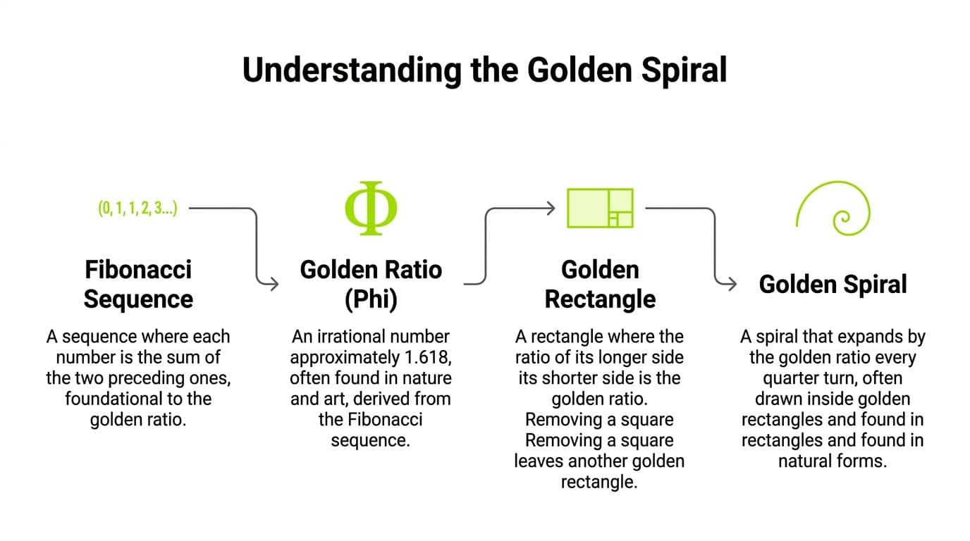
The proportion behind it is commonly associated with the Fibonacci sequence, 1, 1, 2, 3, 5, 8, and so on. The Encyclopaedia Britannica explanation of the golden ratio covers the underlying proportion well, but creators do not need to calculate anything in the field. The job is to recognize a frame where the eye can enter wide, travel along a curve, and finish on the thing that sells the shot.
That finishing point is the whole game.
Place the face, product, hand, logo reveal, or key object near the tight inner coil. Let the larger shapes support that move. A bent arm can feed into it. A streak of light can feed into it. So can a road, a microphone boom, a strand of hair, or the direction of a subject's glance. The spiral works best when several elements push attention inward without making the composition feel staged.
Core idea: Put the subject with the highest storytelling value near the tight coil, then build the rest of the frame to guide the eye into it.
This is why the spiral keeps showing up in strong thumbnails and freeze-frames. A thumbnail has one job. Stop the scroll and explain the story in a split second. Straight grid placement can organize a frame, but curved visual flow helps hold attention long enough for the click. For YouTubers, that often means the coil sits on an eye, a mouth mid-reaction, or the product detail people care about most. In shorts and reels, it can shape a hero frame that still reads cleanly after motion blur, text overlays, and aggressive cropping.
The trade-off is real. The spiral is more powerful than a simple grid, but it is also easier to force. If the scene has no natural curve, adding one can make the frame feel overworked. Clean talking-head videos, software tutorials, and dead-on product shots often perform better with simpler structure. Save the spiral for frames that already contain motion, gesture, bend, depth, or directional energy.
Applying the Spiral to Your Compositions
A winding road, a hand reaching across frame, smoke curling behind a face, a river bending toward the horizon. These are the scenes where golden spiral photography starts to feel unfairly effective.

The strongest use of the spiral is usually not “put subject somewhere near the curve.” It's more deliberate than that. You place the main point of attention where the spiral tightens, then arrange the rest of the frame so the eye naturally circles inward.
Research summarized by Photography Hero's golden ratio guide reports that golden spiral photography increases perceived visual harmony by 23-27% compared to rule-of-thirds compositions, and that the spiral's curved leading lines create 31% more eye movement iterations before the viewer reaches the focal point, while also increasing image memorability by 22%. Those numbers line up with what many working shooters notice in practice. The frame holds attention a little longer.
Where the eye should land
In a portrait, the tight coil often works best around the dominant eye, the face, or the hand if the hand is doing the storytelling.
In certain settings, the coil might sit on a cabin, a sunlit peak, or a lone person. The outer arc can be shaped by shoreline, path, cloud movement, or negative space. In a product shot, the spiral can start with wider supporting context and collapse into the object detail that sells the image.
A few practical placements work again and again:
The frame should feel like it narrows into meaning.
- Portraits: Put the nearer eye or expression point into the coil. Let hair, shoulders, or light fall along the curve.
- Thumbnails: Put the face, object, or shocking detail where the spiral closes. Don't waste that spot on empty background.
- B-roll: Start with a broad motion path, then let the viewer end on a detail. Door handle. Keyboard key. Watch face. Coffee pour.
How this changes thumbnails and short-form shots
Creator workflows benefit most from this principle. A lot of thumbnails fail because every element screams at once. Face, text, arrows, glow, object, background clutter. The eye has no hierarchy. The spiral solves that by forcing you to choose a destination.
For a YouTube thumbnail, try this layout: put the expression or object reveal in the coil, sweep a gesture or directional line toward it, then keep less important detail toward the wider tail. Text should support the path, not block it. If your text cuts across the natural curve, the frame fights itself.
For vertical video, the spiral still works. You just rotate it to match the scene. The coil may sit higher or lower than you'd expect, especially in Shorts where hands, faces, and props stack vertically.
If you want references for high-performing creative packaging, a curated bank like the Creative Library for content inspiration is useful because you can study how strong images lead the eye before the title even gets read.
The video below gives a good visual sense of how curved composition can be recognized in real scenes:
What doesn't work is pretending the spiral is magic. If the scene has no directional energy, no curve, and no hierarchy, slapping a spiral crop on it won't save it. You still need one clear subject and supporting elements that know their job.
Golden Spiral vs Rule of Thirds
The easiest way to choose between them is to stop thinking in terms of “better” and think in terms of effect.
The rule of thirds gives you order fast. It's clean, teachable, and forgiving. You can hand a camera to a beginner, show them the grid, and they'll improve immediately. That's why it's lasted. It's reliable.
The golden spiral asks more from the frame. It needs movement, hierarchy, and a subject that deserves a destination. When it works, it feels less instructional and more cinematic. When it doesn't, it looks forced.
What each rule does well
Use the rule of thirds when the message needs to be simple. Talking-head videos, product comparisons, tutorials, and scenes with obvious left-right balance often benefit from that structure. It keeps the composition readable.
Use the spiral when you want the frame to feel discovered rather than arranged. It shines with curves, asymmetry, gesture, environment, and scenes where you want the viewer to travel before they arrive.
A thirds composition says, “Look here.” A spiral composition says, “Come this way.”
That's why I often treat the rule of thirds as the safe option and the golden spiral as the persuasive option. Not always. But often.
Golden Spiral vs. Rule of Thirds at a Glance
| Attribute | Golden Spiral | Rule of Thirds |
|---|---|---|
| Visual effect | Dynamic, flowing, organic | Stable, balanced, direct |
| Eye movement | Curved path toward a focal destination | Fast scan across straight divisions |
| Best for | Thumbnails, portraits, landscapes, dramatic B-roll | Tutorials, clean layouts, beginner composition |
| Difficulty | Harder to see at first | Easy to learn quickly |
| Risk | Can feel forced if the scene has no natural flow | Can look repetitive and formulaic |
| Ideal creator use | Packaging that needs depth and intrigue | Packaging that needs clarity and speed |
If you're building channel packaging, testing both is smart. A simple tool set for AI thumbnail creation can help you compare alternate layouts quickly, especially when one version needs straight-line clarity and another needs more visual pull.
Shooting and Editing with the Spiral in Mind
The golden spiral is not some mystical thing you either have or you do not. It is a framing habit, and creators can build it fast.
For YouTubers and short-form creators, that matters because a spiral-based frame often gives a thumbnail more pull than a flat centered shot. The eye enters, travels, and lands. That extra movement is often the difference between a frame people scroll past and one that earns a pause.

How to see it before you shoot
Start with motion and shape, not the subject label. In practice, I look for anything that can carry the eye: a bent arm pointing toward a face, a desk edge leading to a product, a curved road behind a car, a staircase wrapping into a doorway, even a mic cable curling toward a presenter. Those lines do more work than a random thirds intersection.
Ask three questions while framing:
A bright edge, a hand gesture, a path, or a strong curve can start the route.
Pick one destination. Face, lens, product, title screen, or a single detail.
If the frame is all straight lines and blunt shapes, use a simpler composition.
This gets more useful in video than still photographers often admit. A thumbnail needs a clear reading at phone size, but the frame also has to feel charged. In a talking-head setup, the spiral might begin in negative space, travel along an arm or desk line, and tighten around the eyes. In B-roll, it might run from foreground object to background action. Same rule. Different job.
A stable setup helps when you are refining tiny framing changes for architecture, product shots, or thumbnail grabs. A lightweight photography tripod is useful because this kind of composition often comes down to moving the frame slightly left, slightly lower, then slightly tighter until the visual path locks in.
Field habit: Move in arcs with your feet. Do not just zoom. The spiral usually appears when angle changes reveal a curve you could not see from your first position.
- Where does the eye enter?
- Where should it end?
- Does the scene support a curve?
How to crop for it in post
Good creators do not treat cropping as a rescue plan. It is part of the design process.
Many cameras and editing apps offer composition overlays, and Lightroom makes spiral-based cropping easy once you enter crop mode and cycle the guides. The practical point is simple. Rotate the spiral until it agrees with the scene. If the curve fights the frame, the crop feels stiff even when the subject sits near the coil.
Use a simple workflow:
Modern creator workflow changes the rule a bit. You are not just composing for a full-screen image. You are composing for a YouTube homepage, a Shorts shelf, and a paused mobile frame. That means the spiral has to survive compression, small size, and text overlays. If your title text blocks the entry path, the composition breaks. If your reaction face sits outside the coil, the wrong element wins.
When I build thumbnails, I often isolate the subject first, then rebuild the frame around a cleaner path. A fast background remover for creator assets helps when the original scene has too much clutter competing with the spiral.
- Set priority first: Place the main subject where you want attention to finish.
- Match the spiral direction: Flip or rotate the overlay to follow the frame's natural flow.
- Cut interference: Remove bright corners, stray props, or background details that pull the eye off the route.
- Control brightness: Keep the center of interest a touch stronger and let the outer edge stay quieter.
- Check thumbnail size: Shrink it down. If the focal point disappears or the path gets muddy, crop again.
What are the common questions?
Does the golden spiral work for vertical photos and videos?
Yes. Rotate it to fit the scene. For Shorts, Reels, and TikTok, the coil often works best around the face, hands, or product detail, with motion entering from above or below rather than from the side.
Can you use both the rule of thirds and the golden spiral in one image?
Sometimes, yes. A strong image can share traits from both. But don't chase both overlays at once while composing. Pick the one that best supports the shot, then see if the other naturally overlaps.
Is the spiral only for landscapes?
Not at all. It works in portraits, product shots, architecture, food, thumbnails, and video stills. It's most effective when the frame contains a clear destination and some kind of directional flow.
Do I need an overlay every time?
No. Overlays help during practice and cropping. Over time, you start recognizing the pattern in curves, spacing, and visual hierarchy without needing the guide visible.
What if the spiral makes the image feel overdesigned?
Back off. That usually means the crop is too forced or the shot would be stronger with a simpler composition rule.
What is the short answer for Golden Spiral Photography a Guide Beyond the Rule of Thirds?
Master golden spiral photography to create more dynamic and beautiful compositions. Learn the concept, see examples, and get tips for photos and thumbnails.
Action checklist
Apply this to your channel today.
- 1Check thumbnail size: Shrink it down. If the focal point disappears or the path gets muddy, crop again.
- 2The re-crop drill: Take old photos or paused video frames and crop them three different ways using spiral logic. Don't ask which is “correct.” Ask which one holds your eye longest.
- 3The spiral hunt: Spend a short walk finding curves in your environment. Stairs, roads, vines, railings, headphones, coffee steam, bike wheels. You're training recognition.
- 4The one-subject rule: Shoot five frames where only one element gets the coil. No competing hero objects.
- 5The thumbnail test: Export two thumbnail versions of the same concept. One with a thirds layout, one with a spiral layout. Compare them at small size.