
What is the quick answer?
Master logo placement on video with practical rules for thumbnails, overlays, and watermarks. Covers sizing, safe zones, platforms, and metrics that matter.
Key takeaways
- The Moment Your Logo Stops Working
- What Logo Placement Really Means on Video
- Three layers decide the outcome
- Placement is a system, not a pin
- The Four Places a Logo Can Actually Live
- Corner badge and persistent watermark
Overview
You're probably looking at a timeline or a thumbnail right now and noticing the same problem creators run into every week. The logo is there, but it isn't really there. It's tucked under a caption bar, fighting the subject's face, or getting cropped into something that looks accidental instead of intentional.
That's the trap with logo placement on video. Most guides treat it like a sticker choice. In practice, it's a moving design decision that has to survive platform UI, cropping, short-form reposts, and the weird little habits people have when they scan a screen for half a second and keep swiping. When the placement is right, the brand mark reads fast, stays out of the way, and still survives the edit. When it's wrong, the content can be strong and still feel unfinished.
The Moment Your Logo Stops Working
You've probably seen it happen without naming it. The video looks fine in the editor, then it lands on mobile and the logo sits right where the subscribe button lives, or the thumbnail text buries it, or the repost strips it down so much that it reads like a random shape instead of a brand mark. That's the moment the placement stops being branding and starts being noise.
The old habit is to ask whether the logo looks pretty in the corner. The better question is whether it still does its job after the platform is done with it. A logo can fail in at least three ways at once. It can lose recognition, it can interfere with the subject, and it can disappear in the one crop that matters.
That's why placement is not just decoration. It's the first branding signal the viewer unconsciously processes, and it has to survive the frame the same way the hook survives the edit. Nielsen Norman Group found that people were significantly more likely to remember a hotel's name when its logo sat in the top-left rather than the top-right, with an 89% lift in brand recall, and that a centered logo made users 6 times as likely to fail to reach the homepage in a single click compared with a left-aligned logo, which is why the top-left became such a durable pattern in left-to-right interfaces Nielsen Norman Group.
Practical rule: if the logo makes you notice the logo before you notice the video, it's probably too loud.
For brand systems that need a cleaner starting point, a structure like a brand guidelines template helps lock down the basics before anyone starts shipping edits.
What Logo Placement Really Means on Video
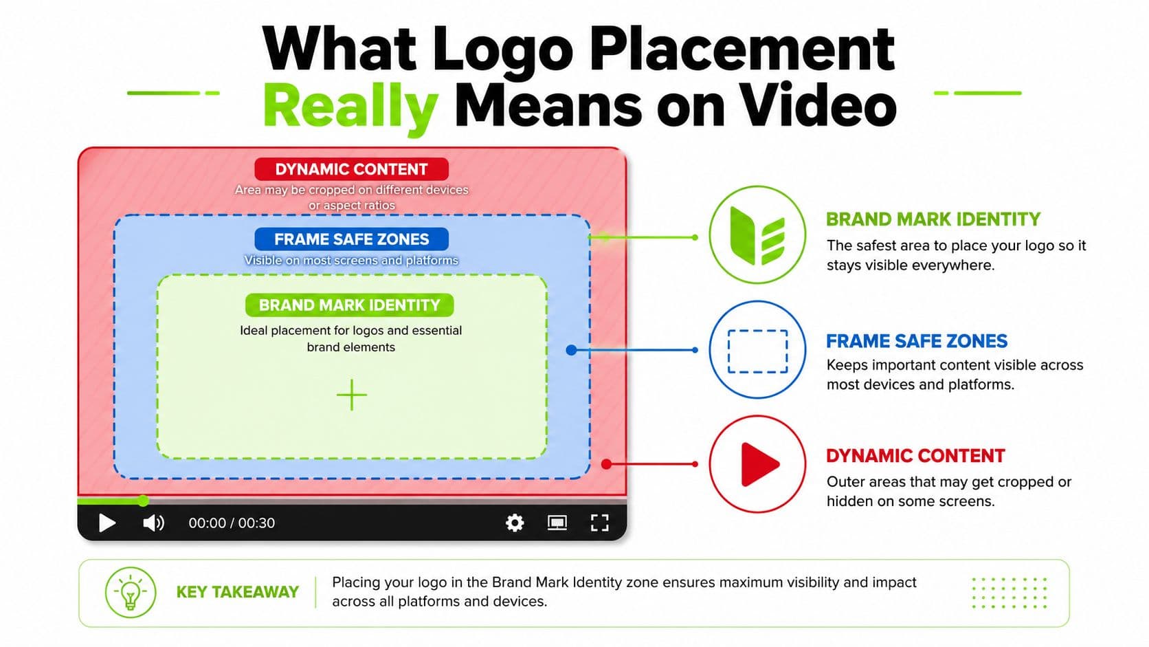
Three layers decide the outcome
The logo has to survive the frame, not just sit inside it. The safe zone is the part of the image that stays readable after crops, overlays, captions, buttons, and platform chrome take their cut. Everything outside that zone is vulnerable, and in video that margin disappears faster than people expect.
That is where most placement mistakes start. A mark can be drawn well and still fail once the edit is exported. The safe zone can be correct and still fail if the logo is pushed too large or too close to competing motion. The frame can be clean and still fail if the brand mark lands on top of clutter, faces, or interface elements that pull attention away from it.
On websites, the default position is usually the top-left corner of the header or navigation bar because it matches left-to-right reading habits and behaves like the first brand anchor users expect to see Logo to Use. Video keeps part of that logic, but it is less forgiving because the frame moves, gets cropped, and picks up layers of interface chrome that were never part of the original composition.
Placement is a system, not a pin
For apparel and print, teams use fixed reference points because vague directions break in production. Industry guidance commonly recommends placing a shirt logo about 3–4 inches below the collar or shoulder seam and 4–6 inches from the center line, while digital graphics often keep the logo at roughly 5–10% of image width with clear space equal to at least half the logo's height on every side Barnimages. Those numbers are not magic. They are practical boundaries that keep the logo legible without letting it bully the composition.
For production, exact measurement beats designer intuition. A tech pack should specify placement from fixed garment points and include a flattened mockup, a placement table, the final vector artwork, and the application method, especially when embroidery is involved Shanghai Garment.
For video, the same discipline matters in a different way. A placement choice has to hold up in thumbnails, short-form crops, and playback screens that shrink the brand mark to the edge of visibility. That is why teams that care about consistency also keep brand compliance tips close at hand, because the logo is not just an asset, it is a rule set that has to survive export.
The useful mental model is simple. The mark is what people remember. The safe zone is where they can still read it. The frame decides whether it makes it through the edit intact.
The Four Places a Logo Can Actually Live
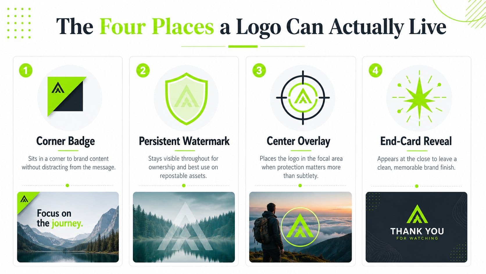
Corner badge and persistent watermark
The corner badge is the workhorse. It sits unobtrusively, earns recognition, and usually leaves the subject alone. That makes it the safest choice for most talking-head edits, product demos, and anything where the frame already has a lot going on. It's not trying to tell the whole story, just making sure the brand doesn't vanish.
The persistent watermark has a different job. It protects reposts, trims, and snippets that travel without context. That's useful when your content might be screen-recorded, clipped, or pushed around by third-party accounts. The trade-off is obvious, it can start to feel defensive if it's too large or too bright.
Center overlay and end-card reveal
The center overlay is the blunt instrument. It works when the logo needs to sit on top of a sponsor segment, a transition, or a frame that would otherwise hide the mark in a corner. It can also cover a sensitive area of the image. Use it sparingly, because central placement competes directly with the subject and can make the edit feel branded in a heavy-handed way.
The end-card reveal is the cleanest of the four when the video needs to finish with a clear brand moment. It lets the viewer experience the content first, then gives the logo a final beat as a call to action or recognition cue. That's why it often works better at the tail of a video than at the start, especially when the opening hook already has enough to do.
For practical policy guardrails on ownership, reuse, and brand consistency, WaveGen's brand compliance tips are a solid reference point.
A good way to think about these four placements is to match the logo's job to the moment in the video. Recognition needs a corner. Survival across reposts needs a watermark. Sponsorship or concealment needs an overlay. Closure needs an end card.
If the logo has to win the scene, the scene is probably already overloaded.
Platform Layouts and Where Your Logo Survives
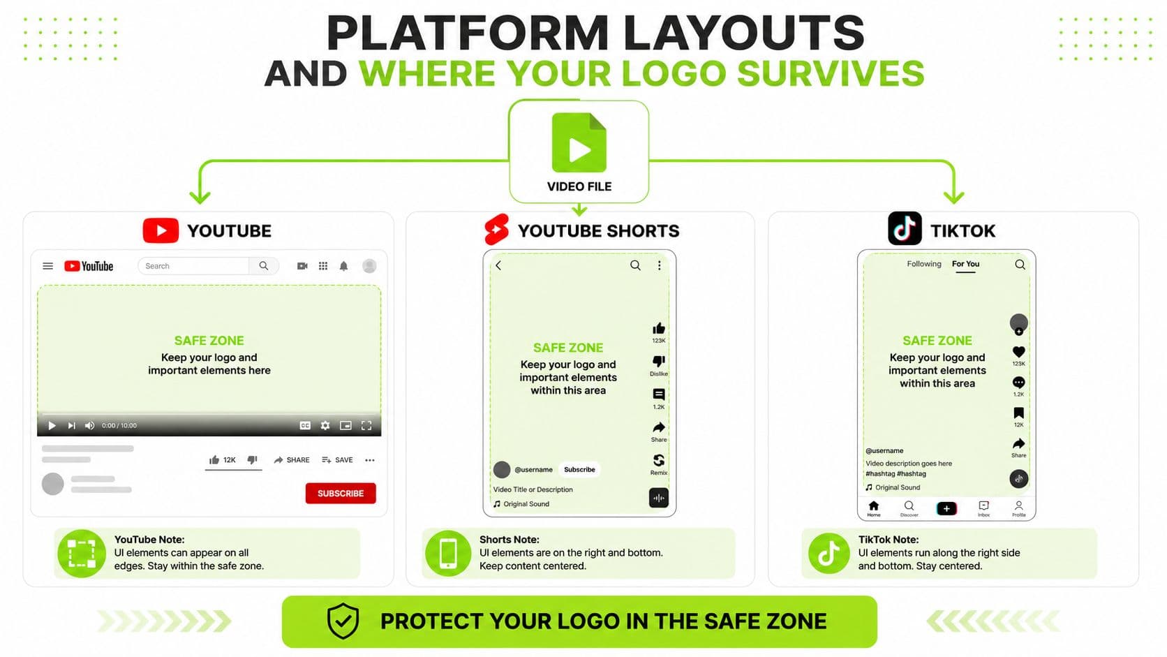
Different feeds punish different corners
YouTube long-form usually gives the logo the most breathing room, especially in the player and on channel surfaces. YouTube Shorts gets tougher, because the interface stacks actions along the side and leaves less visual patience for anything low or right. TikTok is even more hostile to bad placement when captions and action controls start eating into the edge of the frame, and Instagram Reels often buries the upper-left area under the username and interface elements.
That means the same logo can feel elegant on one platform and invisible on another. A mark in the lower-right might work in a clean edit, then get clipped by a button stack in Shorts. A top-left badge can feel smart on desktop, then vanish under account chrome on a Reel. The safest instinct is not to pick one universal spot and hope for the best, it's to map the platform UI first and place the logo where the player leaves room.
What to protect on each platform
For creators trying to grow in short-form, the placement problem shows up early, before the edit even feels polished. That's why guides like TikTok cinematic strategies matter when you're thinking about visual hierarchy, not just composition.
The video file doesn't change. The layout does. That's the thing that makes placement feel inconsistent until you start treating every platform like a different puzzle.
- YouTube long-form: keep the logo away from the most movement-heavy part of the subject and leave room for title overlays and end-screen elements.
- YouTube Shorts: avoid the lower-right zone, because the interface uses that side heavily and the frame is narrow enough that small mistakes show up fast. The format guidance in this YouTube Shorts video size guide is useful when you're planning safe areas.
- TikTok: watch the right edge carefully, because captions and controls can crowd the logo before the viewer even registers it.
- Instagram Reels: don't trust the upper-left by default, since the account name and UI can crowd that zone.
Keep the logo present, not pushy
Logo size is one of those choices that looks minor in the timeline and obvious on a phone screen. A mark that sits around 5–10% of image width is usually legible without taking over the frame. Push past that and the branding starts acting like another foreground object the viewer has to work around, which is a bad trade if the clip depends on faces, product detail, or a fast visual reveal.
Opacity should follow the same rule. The logo needs to signal ownership without becoming the loudest shape in the shot. If it sits over busy footage, softening it enough to keep the subject visible is usually the better move than forcing full-strength contrast into every frame. On apparel footage, especially when fabric stretches or moves, a logo can distort quickly, so leaving extra space around it is safer than chasing perfect symmetry.
What are the common questions?
What is the short answer for Logo Placement That Actually Works on Video?
Master logo placement on video with practical rules for thumbnails, overlays, and watermarks. Covers sizing, safe zones, platforms, and metrics that matter.
What should creators do first?
Measuring Whether the Placement Is Actually Working
Who is this guide for?
This guide is for YouTube creators, faceless channel operators, agencies, and teams using AI tools to improve video production and growth.
Action checklist
Apply this to your channel today.
- 1Measuring Whether the Placement Is Actually Working
- 2YouTube long-form: keep the logo away from the most movement-heavy part of the subject and leave room for title overlays and end-screen elements.
- 3YouTube Shorts: avoid the lower-right zone, because the interface uses that side heavily and the frame is narrow enough that small mistakes show up fast. The format guidance in this YouTube Shorts video size guide is useful when you're planning safe areas.
- 4TikTok: watch the right edge carefully, because captions and controls can crowd the logo before the viewer even registers it.
- 5Instagram Reels: don't trust the upper-left by default, since the account name and UI can crowd that zone.