
What is the quick answer?
Master contrast enhancement in video with practical workflows, techniques, and tips creators use to get sharper, more cinematic footage in any tool.
Key takeaways
- Why More Contrast Is Usually the Wrong Move
- What contrast really is
- Use scopes before you touch the slider
- The Core Toolkit Every Editor Should Know
- The first pass is about anchors, not style
- Local contrast is a different animal
Overview
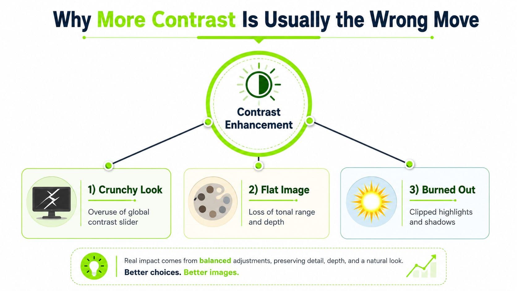
The contrast slider feels decisive, so many editors reach for it. In practice, that's how you get crunchy skin, clipped skies, and captions that turn into mush. Real contrast enhancement is less about “more” and more about deciding what deserves separation, what should stay soft, and what must survive the grade intact.
A flat image isn't automatically a bad image. A log clip, a hazy scene, or a phone shot with smashed shadows often just needs shape, not brute force. The useful mindset is simple, protect information first, then build contrast in layers.
Why More Contrast Is Usually the Wrong Move
The bad habit is obvious. A clip looks dull, so someone drags the contrast slider until the image snaps awake, and suddenly the file looks like it got hit with a hammer. That move can make a frame feel punchier for a second, but it often wrecks the stuff that matters, like facial texture, subtle sky gradients, and readable caption edges.
What contrast really is
Contrast is the spread between the darkest and brightest usable values in a frame. In a healthy image, blacks have a place to sit, highlights have room to breathe, and the midtones carry the detail you look at. If the histogram is packed into a narrow band, the frame will feel flat, but that doesn't mean the footage is broken.
The useful question is not, “How much contrast can I add?” It's, “What information am I trying to reveal without destroying the rest of the image?” That's the whole game.
Use scopes before you touch the slider
A histogram tells you where the data lives, but scopes tell you whether the image is behaving. If shadows are jammed against the left wall, you're probably crushing detail. If highlights are pinned hard to the right, you're clipping bright information that's gone for good.
A flat log image can look ugly straight out of camera and still grade beautifully. A muddy recapped image can also look busy and still be unusable because the tonal structure is already damaged. The trick is to separate low contrast from lost contrast information.
Practical rule: if the shot still contains shape in the waveform, you can usually build a better grade than the slider would suggest.
For a quick editor's check, I like a simple sequence. First, identify the darkest meaningful part of the frame. Second, decide where the brightest detail should land. Third, only then decide whether the image needs a global contrast move or a softer local pass. If you're comparing tools and cleaning up footage, the color correction tool guide is a useful companion piece for that workflow.
The Core Toolkit Every Editor Should Know
Curves, levels, gamma, exposure, CLAHE, LUTs, and color grading all sit in the same toolbox, but each one fixes a different problem. Mixing them up is how you get a grade that looks loud and still feels out of control. Start with the smallest tool that solves the issue, because contrast enhancement works best as a layered decision, not a single slider move.
The first pass is about anchors, not style
Levels set hard black and white points. That makes them useful when the image needs a clean floor and ceiling before anything else happens. Gamma shifts midtones without trampling the extremes, so it's a good move when faces need a little lift but highlights are already near where they should be.
Curves give the most shape control because you can bend the tonal response exactly where the frame needs it. That is why curves are the editor's scalpel. Exposure is broader and more global, so it works better for correcting a shot that was under or overdone at capture.
| Tool | Best For | Watch Out For |
|---|---|---|
| Curves | Precise tonal shaping, gentle S-curves, selective rolloff | Easy to overdo and make the frame look harsh |
| Levels | Establishing black and white anchors | Can clip detail fast if you shove the endpoints too far |
| Gamma | Midtone control without heavy end-point damage | Can make faces look muddy if pushed blindly |
| Exposure | Overall brightness correction | Often changes the whole image too broadly |
| CLAHE | Recovering detail in flat or hazy areas | Can bring up noise if the scene is already dirty |
| LUTs | Fast starting looks | A LUT is not a finishing move |
| Color grading | Mood, balance, and story tone | It is separate from contrast work, even if people blend them |
If you want a stronger technical comparison for cinematic color grading with scopes, that resource is useful because it ties the look back to measured values instead of guesswork.
Local contrast is a different animal
CLAHE-style local contrast helps where a global pass would flatten the whole frame. It is the move for hazy foliage, weak texture in a dim interior, or detail buried in a narrow tonal pocket. Use it sparingly, though, because local contrast can make noise and compression artifacts more obvious than they were before.
LUTs sit near the end of the chain, not the beginning. They can be a useful starting point for mood, but if the underlying contrast is wrong, the LUT just makes the mistake prettier. Color grading comes after the contrast decisions, because mood is easier to judge once the frame already has a stable tonal spine.
If you are comparing workflows and tools, the AI tools for video editing workflow is a good reference for how creators are chaining these decisions together faster now.
A Practical Satura AI Workflow That Actually Holds Up
A reliable grade starts with a baseline recovery pass, not a stylistic flex. I'd treat AutoEnhance as the first look, because it gives you a faster read on what the footage can support before you get stubborn about manual tweaks. Once that foundation is in place, you can make actual decisions instead of guessing in the dark.
Start with the baseline, then shape the frame
The first move is simple. Run the automatic recovery pass, then check the waveform to see whether blacks are sitting too low or highlights are too hot. If the image already looks workable, stop overcorrecting and move straight to manual curves.
From there, use curves to define the image's shape. A mild lift in the lower mids can recover faces without flattening the entire background. If the clip starts to look plasticky, you've gone too far and need to back off before adding anything else.
Stop the global pass earlier than feels comfortable. Most bad grades happen because someone keeps “fixing” a shot after it's already good enough.
Protect skin and then add detail where it matters
The vectorscope is your sanity check for skin. Keep an eye on the flesh line, because if skin drifts off it, the grade starts feeling artificial fast. A subtle red-channel lift can help if the face looks cold, but don't force it into that orange-face zone that makes everyone look sunburned under office LEDs.
Once the face is stable, add local contrast only where the viewer needs detail. Eyes, hair, product surfaces, and fabric texture can benefit from a focused pass. The point is not to make the whole frame sharper or louder, it's to direct attention.
The video montage maker guide is useful if you're assembling sequences where that kind of selective emphasis needs to survive fast pacing and repeated cuts.
A simple four-step spine
That workflow holds up because it respects order. Global first, local second, color discipline all the way through.
- Baseline recovery, get the image into a usable tonal range.
- Manual curves, set the actual shape of the shot.
- Scoped refinement, check waveform and vectorscope before you chase mood.
- Selective detail, add local contrast only where the frame needs separation.
Workflows for the Footage You Actually Shoot
Different footage breaks in different ways, so the same contrast move won't save every clip. Talking heads want facial stability. Scenic views want highlight rescue and controlled texture. Low-light footage wants restraint. Phone footage wants damage control before polish.
What are the common questions?
What is the short answer for Contrast Enhancement for Video Creators?
Master contrast enhancement in video with practical workflows, techniques, and tips creators use to get sharper, more cinematic footage in any tool.
What should creators do first?
Baseline Grade, run the first recovery pass and make sure the shot is usable, not just brighter.
Who is this guide for?
This guide is for YouTube creators, faceless channel operators, agencies, and teams using AI tools to improve video production and growth.
Action checklist
Apply this to your channel today.
- 1Baseline Grade, run the first recovery pass and make sure the shot is usable, not just brighter.
- 2Protect Skin, check the vectorscope and keep flesh tones believable before you chase style.
- 3Shape Contrast, use curves for mood and midtone control instead of hammering the global slider.
- 4Final Check, review the whole sequence on a calibrated display and look for clipping, noise, and caption legibility.
Sources & methodology
- Satura editorial guide based on the source video, topic cluster, and article sections.
- Source video reviewed for this article: https://www.outrank.so/